
When an AI Thinks Like a Creative Director
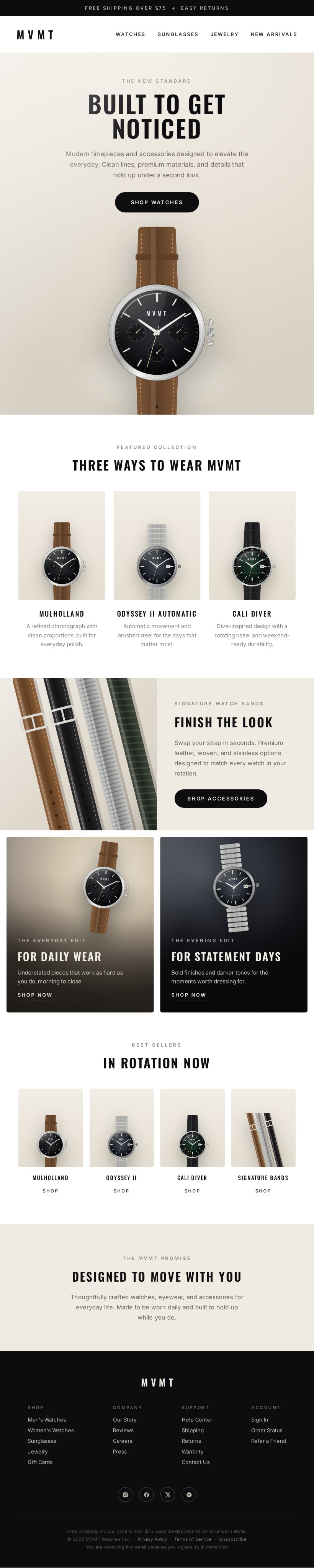
At first glance, the output looks like an impressive image generation demo. But the real achievement isn't visual quality—it's how Claude Fable 5 interprets a complex creative brief.
Here's the prompt Chase Dimond used:
"Create a full-length, tall vertical ecommerce email mockup for MVMT, a modern watch and accessories brand for millennials. Design a highly realistic premium DTC email that feels sleek, polished, minimal, masculine-leaning, and editorial. The final image should look like a real designer-made ecommerce email screenshot, not a poster, not a landing page, and not a generic template.
Brand vibe: Modern California-cool, youthful, confident, clean, aspirational, stylish, and elevated. The design should feel luxury-adjacent but still accessible.
Feature these products prominently: Mulholland, Odyssey II Automatic, Cali Diver, Signature Watch Bands.
Visual style: clean premium ecommerce design, refined editorial layout, realistic product photography, subtle lifestyle imagery, strong hierarchy, crisp sans-serif typography, generous spacing, subtle shadows, restrained modern color palette.
Color palette: Black, white, charcoal, warm gray, stone, soft beige, brushed metal tones, and subtle muted accents. Keep the palette neutral and premium.
Important creative direction: This should feel like a polished watch-brand email campaign with strong design taste. Prioritize realism, elegance, and clarity. Make it feel like something MVMT could actually send.
Build the email in this order:
Top promo bar: "FREE SHIPPING OVER $75 + EASY RETURNS"
Header: MVMT logo + navigation (WATCHES SUNGLASSES JEWELRY NEW ARRIVALS)
Hero section: "BUILT TO GET NOTICED" + CTA "SHOP WATCHES" + premium watch imagery with lifestyle scene
Featured collection: "THREE WAYS TO WEAR MVMT" with Mulholland, Odyssey II Automatic, Cali Diver product cards
Accessory banner: "FINISH THE LOOK" featuring Signature Watch Bands + CTA "SHOP ACCESSORIES"
Editorial promo tiles: "FOR DAILY WEAR" and "FOR STATEMENT DAYS" side-by-side
Shoppable row: "IN ROTATION NOW" with 4-item product grid
Brand signoff: "DESIGNED TO MOVE WITH YOU"
Footer: Branded footer with links, social icons, legal text
Typography direction: Use bold condensed or modern sans-serif typography for major headlines and clean sans-serif body text. Headlines should feel sharp, modern, and fashion-forward.
Photography direction: Use premium product photography with realistic reflections, polished materials, soft shadows, and clean surfaces.
Composition rules: tall vertical email format, clear section separation, realistic email proportions, strong hierarchy, mostly legible text, premium spacing, intentional alignment, balanced mix of product and lifestyle imagery.
Avoid: messy collage styling, playful scrapbook aesthetics, overly colorful design, cheap template vibes, cartoonish imagery, cluttered layouts, fake-looking UI elements, poster-style composition, excessive promotional chaos."
The prompt isn't simply asking for "an ecommerce email." It's asking the model to juggle dozens of interconnected constraints simultaneously.
It has to understand the personality of the MVMT brand—modern, aspirational, California-inspired, masculine but accessible—and express that consistently through typography, spacing, photography, colour, and layout. It has to recognise that "luxury-adjacent" doesn't mean luxury, and that "editorial" is a different aesthetic from a traditional promotional email.
It also has to reason about information hierarchy. The prompt defines a nine-section structure, from the promotional banner and navigation through product collections, editorial tiles, accessories, and footer. Rather than producing a collage of disconnected elements, the model has to build a coherent visual narrative that guides the reader through the email.
Another notable strength is constraint following. The brief specifies products to feature, headlines to include, calls to action, colour palettes, typography, composition rules, and even a list of design patterns to avoid. Losing track of these details is a common failure mode for generative models as prompts become longer. Fable 5 appears unusually capable of keeping those constraints active throughout generation.
Perhaps the most interesting capability is abstraction. The prompt rarely specifies exact pixels or dimensions. Instead, it describes concepts such as "premium," "editorial," "clean hierarchy," and "generous spacing." These are ideas that human designers routinely work with but are difficult to reduce to rigid rules. Producing a convincing result requires translating subjective creative language into concrete design decisions.
This is why the prompt reads more like a creative director's brief than an image prompt. It's not instructing the model where every element belongs; it's communicating the intent behind the design and trusting the model to make hundreds of small decisions that support that intent.

About the author
Will Berrington
Will Berrington is an artist and researcher at the University of Warwick.